|
PythonPlaza -
Python & AI
|
Matplotlib
Matplotlib is very useful for performing a wide range of visualization tasks. It was developed by John D. Hunter in 2003.
It enables users to graphically represent data for easier analysis.
Here are some reasons for using Mathplotlib.
1.) Used for creating plots like line, bar, scatter plots.
2.) Customize plots with labels, titles, legends, color schemes.
3.) Saving plots in various formats like PNG, PDF and SVG.
4.) Combine multiple plots into subplots for data representation.
5.) Create the interactive plots using the widget module.
Line chart in Matplotlib
Line charts are used to represent the relation between two data X and Y on a different axis.
Let's see an example below.
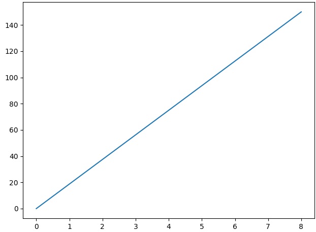
Code Example 1:
import matplotlib.pyplot as plt
import numpy as np
xpoints = np.array([0, 8])
ypoints = np.array([0, 150])
plt.plot(xpoints, ypoints)
plt.show()
#Output:
 Code Example 2:
#Plot line with x & y coordinates
import matplotlib.pyplot as plt
import numpy as np
xpoints = np.array([1,5,7])
ypoints = np.array([3, 9, 10])
plt.plot(xpoints, ypoints)
plt.show()
#Output:
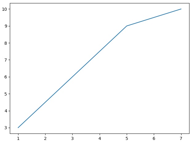
Code Example 2:
#Plot line with x & y coordinates
import matplotlib.pyplot as plt
import numpy as np
xpoints = np.array([1,5,7])
ypoints = np.array([3, 9, 10])
plt.plot(xpoints, ypoints)
plt.show()
#Output:
 Code Example 3:
#Plot line with x & y coordinates
import matplotlib.pyplot as plt
x = [0, 1, 2, 3, 4]
y = [0, 1, 4, 9, 16]
plt.plot(x, y)
plt.show()
#Output:
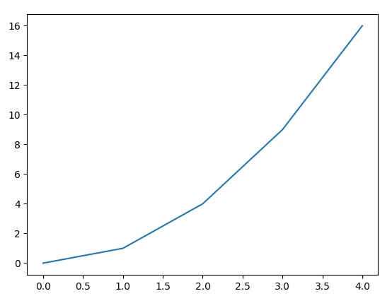
Code Example 3:
#Plot line with x & y coordinates
import matplotlib.pyplot as plt
x = [0, 1, 2, 3, 4]
y = [0, 1, 4, 9, 16]
plt.plot(x, y)
plt.show()
#Output:
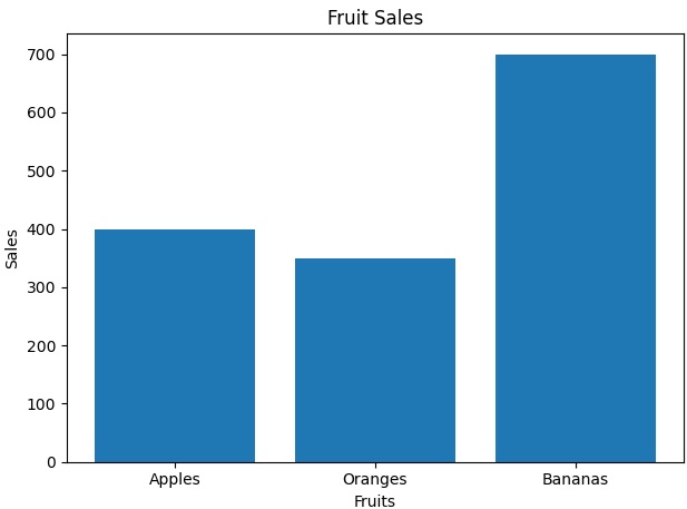
Bar Plot in Matplotlib
A bar plot has rectangular bars that can represent the categories of data. The bar length or height proportional to their values.
Let's see an example below.
Code Example 4:
#Bar Plor
import matplotlib.pyplot as plt
import numpy as np

fruits = ['Apples', 'Oranges', 'Bananas']
sales = [400, 350, 700]

plt.bar(fruits, sales)
plt.title('Fruit Sales')
plt.xlabel('Fruits')
plt.ylabel('Sales')
plt.show()
#Output:
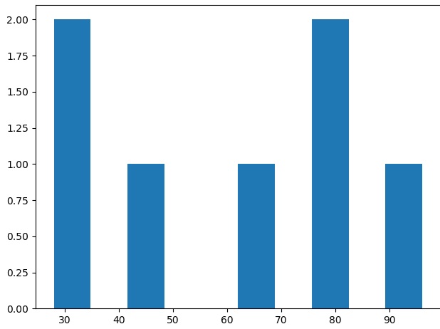
Histogram in Matplotlib
Histogram gives a visual representation of the distribution of data that is divided into bins. The height of each bin represents the frequency or density of values
Code Example 5:
#A Histogram:
import matplotlib.pyplot as plt
data = [32, 96, 45, 67, 76, 28, 79]
plt.hist(data)
plt.show()
#Output:
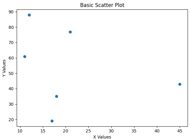
Matplotlib Scatter
Scatter plots are one of the most use tools for visualizing relationships between two variables. Each point in a scatter plot represents a data point that allows us to analyze how two variables cluster or distribute.
Code Example 6:
#Scatter Plot
import matplotlib.pyplot as plt
import numpy as np

x = np.array([12, 45, 11, 18, 21, 17])
y = np.array([88, 43, 61, 35, 77, 19])

plt.scatter(x, y)
plt.title("Basic Scatter Plot")
plt.xlabel("X Values")
plt.ylabel("Y Values")
plt.show()

#Output:
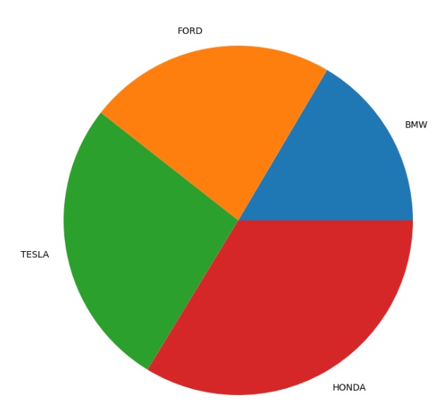
Pie Chart using Matplotlib
A pie chart consists of slices that represent different categories. The size of each slice is proportional to the quantity it represents.
Code Example 7:
#Pie Chart.
from matplotlib import pyplot as plt
import numpy as np


# Creating dataset
cars = ['BMW', 'FORD','TESLA', 'HONDA']

data = [245,340,399,500]

# Creating plot
fig = plt.figure(figsize=(10, 7))
plt.pie(data, labels=cars)

# show plot
plt.show()

#Output:
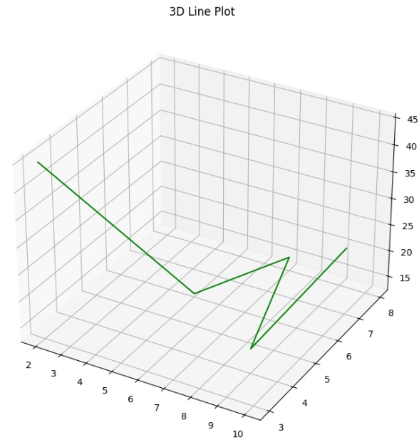
3D Plot using Matplotlib
Sometimes we may have data with 3 variables. Using Matplotlib to plot the 3D Plot helps us to Visualizing better to understand better.
Code Example 8:
#3D Plot.
from matplotlib import pyplot as plt
import numpy as np

ax = plt.axes(projection='3d')

z = [45,13,15,17,25]
x = [2,5,7,9,10]
y = [3,6,8,4,7]

ax.plot3D(x, y, z, 'green')
ax.set_title('3D Line Plot')
# show plot
plt.show()
#Output:
About Us | Contact Us | Sitemap | Privacy Policy